The Noticeboard That People Can Actually Read
A readable community noticeboard groups notices by what readers need to do, making local opportunities easier to spot and the board simpler to maintain.
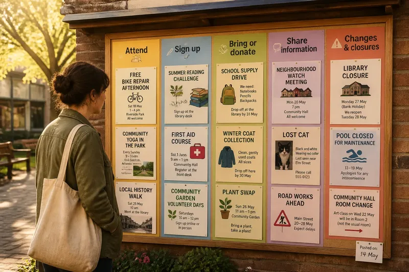
A resident pauses beside the library noticeboard, scans a dense patch of flyers, then leaves without finding the room-change notice they came for. A clearer community noticeboard groups information by what a reader needs to do, not by which club or office posted it. That small change makes the board easier to scan and gives its caretakers a practical way to keep it current.
Sort notices by the reader’s next action
A board organized by publisher asks readers to know the local landscape before they can find anything. Someone looking for a class might have to check the library, recreation club, and neighborhood association sections separately. An action-based layout lets that person look in one predictable place.
Useful groups might include “Attend,” “Sign up,” “Bring or donate,” “Share information,” and “Changes and closures.” Choose words that match the decisions people actually make in your space. If few notices ask for donations, that category may not deserve a permanent heading.
Keep categories distinct enough that a reader can choose quickly. “Join” and “Participate” may sound different to the organizers but feel interchangeable to someone passing by. If two headings seem to attract the same notices, combine them and use the freed space for a more useful distinction, such as “This week” and “Coming up.”
Make the headings visible before the fine print
Readers usually decide whether a notice matters before they read its details. Give each category a clear heading, then make the first line of every flyer state its subject in plain language: “Free bike repair afternoon” is easier to recognize than an organization’s name alone.
Use a consistent reading order, such as left to right and top to bottom, and leave a little space between groups. Colored paper can help separate sections, but color should not carry meaning by itself; people may have limited color vision, and the board’s lighting can change how shades appear. Words, borders, and placement should still make the categories clear.
Readable type matters more than decorative styling. Avoid handwritten details in tiny lettering, crowded paragraphs, and pale text on a bright background. A flyer can keep its distinctive design while its date, location, and requested action remain easy to spot from a comfortable standing distance.
Give each notice a clear job
A useful notice answers a few immediate questions: What is happening? Who is it for? When and where? What should a reader do next? If one of those answers is missing, the board’s category cannot compensate for it.
Invite contributors to put the action near the top, followed by essential details and a contact method. “Register at the front desk” is more useful than “For more information, inquire,” especially if readers do not know whom to ask. Where space is tight, a short link or clearly printed email address can point to fuller details, but the paper notice should still say what the opportunity is.
Imagine a community garden posting a flyer for a work morning. If it sits under “Bring or donate,” a reader might assume the request is for tools; if it sits under “Attend,” the title and time make the invitation plain. The garden can add a separate note asking people to bring gloves, while keeping attendance and supplies from competing for the same message.
Use a simple posting routine to keep the board current
Grouping notices by action also clarifies maintenance. A caretaker can scan each section for missing dates, expired events, or requests that no longer have a clear next step. That is more useful than asking only whether every local organization has its own patch of cork.
Set a modest routine that suits the board’s traffic: for example, check it on the same day each week, remove notices for events that have passed, and ask contributors to replace any flyer whose details have changed. A small “posted on” space can help caretakers judge freshness without turning the board into a paperwork exercise.
Agree on a few posting rules and display them where contributors can see them. Keep them practical: use the right category, include a contact route, and leave room around other notices. If the board belongs to a public building, follow its existing posting policy rather than creating a competing one.
Not every item needs to be redesigned to match a polished template. Requiring identical fonts, colors, or layouts can discourage a small group that has a straightforward announcement. The worthwhile effort is making the action and essential details readable; elaborate decoration and strict visual uniformity usually add little.
Review the categories by watching how people use them
A category system should respond to the board, not become a rule that the board must obey. Notice which sections stay crowded, which remain nearly empty, and where contributors repeatedly place the same kind of notice. Those visible patterns can suggest a better division without requiring a formal survey.
If “Attend” fills with both recurring classes and one-time events, consider whether readers would benefit from separating them. If “Share information” holds lost-property notes, road closures, and announcements, those may call for distinct headings because they lead to different actions. Change one confusing distinction at a time, then see whether people can find the relevant notices more readily.
Ask a few people who did not arrange the board to locate a particular item. Their pauses and wrong turns can reveal labels that make sense only to the organizers. The goal is not to quiz them; it is to notice whether the headings match the questions readers bring to the board.
How should a community noticeboard handle common cases?
Where should a notice that fits two categories go?
Place it where the reader’s main action belongs, then mention any secondary request in the notice itself. A volunteer event that also asks for spare supplies can go under “Attend,” with the supply request stated clearly in the details.
Should every group have its own section?
Usually not: organization-based sections make readers guess who might have posted the information. A group name can appear on each flyer, while the board’s larger headings direct people by the task or decision they came to find.
What belongs in a small noticeboard?
Keep the same few action categories, but reduce the number of notices displayed at once. A smaller board benefits from current, legible information more than a dense collection of every announcement in the area.
How can caretakers avoid removing useful information too soon?
Give contributors a simple way to mark whether a notice is ongoing, such as “recurring” or “until filled,” and ask for a contact route. For anything with a fixed event date, clearing it after the event keeps the board useful to the next reader.
Let the layout serve the next reader
A community noticeboard is easier to trust when its arrangement reflects ordinary questions: Can I attend? Do I need to sign up? Is something changing? Grouping by action turns those questions into visible routes through the board, while a light maintenance routine keeps the routes open.
For a readable community noticeboard, start with the busiest cluster rather than rebuilding the whole display. Add one plain-language heading, move the relevant notices together, and check whether someone unfamiliar with the organizers can find what to do next. That small, observable adjustment gives the board a useful purpose beyond holding paper.